Citizen Experience: SF-95

Check out the story, or head straight to TSAClaim.com, a website that makes filing a claim with the TSA super easy. 

In December I returned back to San Francisco after spending the holidays with family, lugging a week’s worth of clothes and gifts in tow. After the flight and commute home, I was disappointed that a glass frame had broken during the trip. I hadn’t packed it particularly well and I didn’t consider it to be a tragic loss. There was something else unexpected but entirely common that I noticed when carefully removing the shards from dirty laundry, a TSA notice of inspection leaflet.

As I mentioned, this frame was easily replaceable and I certainly could have taken more precautions in preparing it for transit, but I couldn’t help but wonder what if it had been something more valuable. What recourse do we have if the TSA damages our possessions when they open our luggage for inspection?  I googled my way to https://www.tsa.gov/travel/passenger-support/claims where you are presented with the some instructions and a link. The link is to a PDF form, the SF-95 to be exact.

The SF-95 became an object of frustration in my mind, evolving from a minor annoyance to representing the lack of progress in how citizens interact with their government given the tools at our disposal. It’s not necessarily for the lack of funding, as evidenced by the Department of Homeland Security’s botched effort to digitize the immigration process. I started to think about all thing things that bothered me about SF-95, and what a refreshed version would look like.

“Interacting with the government” largely consists of sending and receiving forms, hoping against hope that you checked the right boxes and something actually gets done. The process to submit a form can be divided into two broad steps: filling it out, and submitting it. The SF-95 makes both an absolute chore.

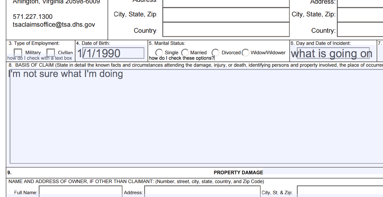
It’s not a particularly long form, but the current version has formatting errors that make it impossible to fill out correctly. You’ll end up with something looking like this:

Screen Shot 2016-03-01 at 1.09.50 AM

To be fair, I was baffled to discover a version of the SF-95 that did have appropriately formatted user input fields. This outdated version, which shows up on google when searching “tsa claim”, is actually pretty easy to fill out! It does not, however, mention the ability to submit the form via email directly to the TSA.

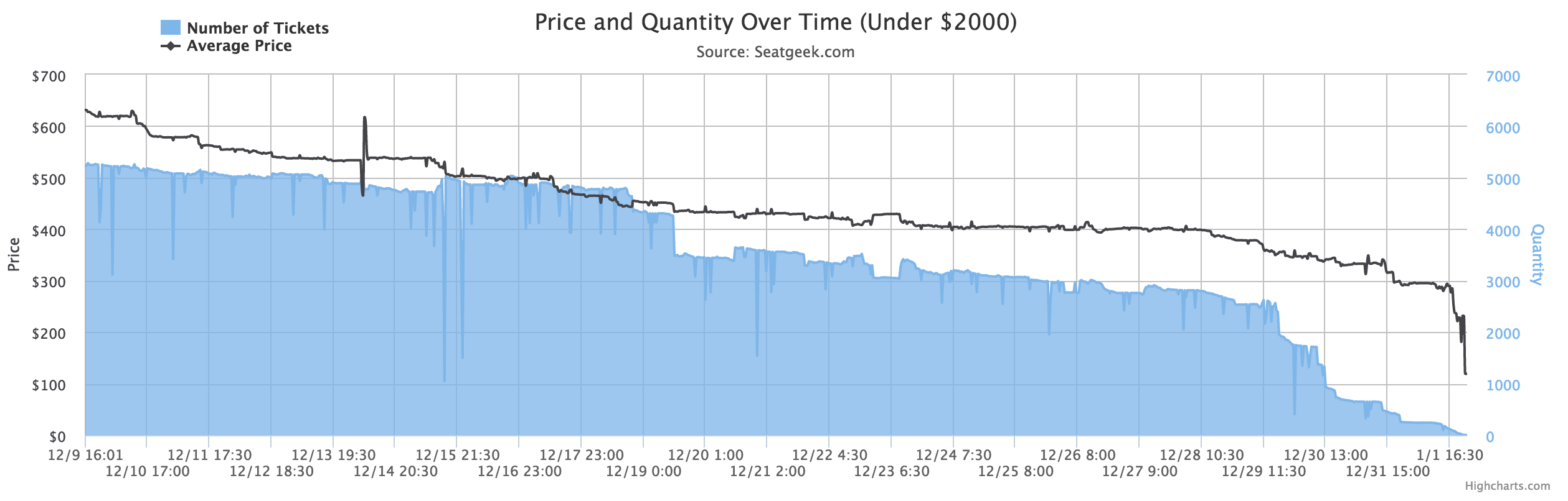
If you do go through the trouble of submitting a claim, you get to join an elite group who can say they’ve done the same. In 2014 only 8,855 people submitted claims to the TSA and about 19% of those claims were approved in full according to data.gov.

Unfortunately, this type of friction is what we have come to expect when dealing with the government. Most government websites are the online equivalent of standing in line at the DMV. Making these online services easy to access and use and  is one way to lift up those who most need to take advantage of them.

Lots of systems are complex underneath but simple to use.  The influence necessary to change the official process in submitting a claim to the TSA is far beyond my comprehension, but a tool to simplify it is achievable in one person’s spare time. That’s why I created TSAClaim.com, an earnest attempt to make it easier for citizens to submit the SF-95. Please email this to your friends who have had something lost or broken during travel where the TSA might be at fault.


How I Found Amazing Sugar Bowl Tickets

Getting these tickets was no accident. As soon as it was announced that Ohio State would be playing Alabama in the Sugar Bowl, I knew I had to go to New Orleans. I didn’t plan on sitting in the nosebleeds either. No, this type of game deserved these type of seats. How did I find them you ask? Surely I must have spent a fortune. Think again, my friend! Instead, I let the computers do their magic for me.

The ticket marketplace is pretty opaque, and finding a good deal can feel like guesswork. Thankfully, SeatGeek is a service that aggregates the available tickets for all kinds of events, and also applies some fancy logic to tell you which tickets are actually good deals. In a short time window, their logic is often all the information I need to make a ticket buying decision.

However, the stakes were higher for the Sugar Bowl and I had a large window of time to make a buying decision. By collecting ticket data over time, I could see if there were any trends that I include in my decision making process. I collected data from SeatGeek for almost a month and visualized it a few different ways using the Highcharts javascript library.

I visualized this data in two ways. The first is illustrated below. The graphic shows how the average price moved over time and in relation to the volume of tickets available. Pretty clearly we can see when new tickets entered the marketplace, as well as a pattern of drastic decreased availability in the days closest to the game.

Screen Shot 2015-06-05 at 10.41.12 AM

The second visualization is a scatter plot showing a snapshot of all of the tickets available.

osu-seatgeek-scatter

Hacker News “Who’s Hiring” Trends

Hacker News is somewhat of a bellwether for the tech industry in many ways.  The discussions that take place in that community are strong signals as to what trends are appearing in Silicon Valley and elsewhere.

On the first day of any given month the top post is guaranteed to be the “Who’s Hiring” post with at least 200 comments and often over 400. I was curious if the content in these particular threads would surface any trends or insights, so I built a tool that allows you to view the word frequency over the past 12 months of Who’s Hiring threads.

I used the Algolia API to download the data and then created two sets of json files, one with the number single word occurrence, and another with two word string occurrences (so you can compare “San Francisco” to “London”).

http://austinhutchison.com/hntrends/

To better compare the trends month over month I’ve taken a look at the number of occurrences divided by the number of words for that month. To get a view of the pure word count just uncheck the ratio box.

Here are the trends that I was most curious to investigate:

Locations

Screen Shot 2014-07-22 at 6.24.09 PM

Languages

Screen Shot 2014-07-22 at 6.24.25 PM

Android v. iOS

Screen Shot 2014-07-22 at 6.24.41 PM

Try it out yourself! I might suggest “growth hacker” and “data science”

Here’s the Github repository

Share any cool comparisons on this HN post

D3 Map

When I started with D3 I wanted to make a visualization that displayed data by state. I had a lot of trouble (which ended up being due to a corrupted us-states.json file). I thought I would share this to help anyone else looking to make a map using D3js.

var w = 960;
var h = 620;

var projection = d3.geo.albersUsa()
.translate([w/2, h/2])
.scale([1200]);

var path = d3.geo.path()
.projection(projection);

var svg = d3.select("body")
.append("svg")
.attr("width", w)
.attr("height", h);

d3.json('us-states.json', function(collection) {
svg.selectAll(".state")
.data(collection.features)
.enter()
.append("path")
.attr("d", path)
.attr("class", "state")
.attr("id", function(d){return d.properties.name})
.style("stroke", "white")
.style("stroke-width", 1.5)
.style("fill", function(d,i) {
console.log(i);
return "rgb(0,0," + (i * 4) + ")"
});
});